Tuesday, July 15, 2014
Far Fewer Adults Uninsured
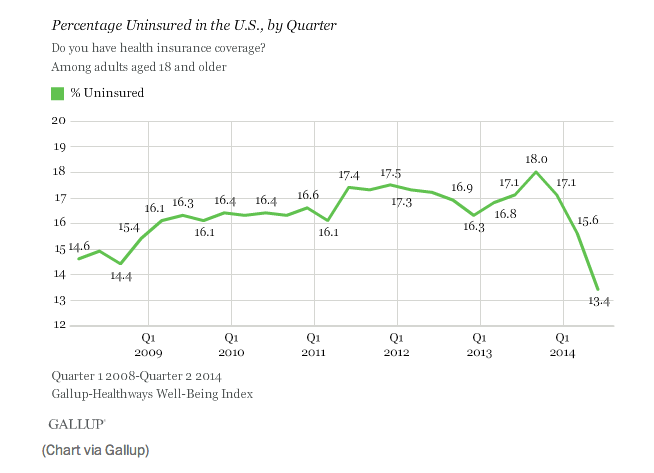
I would have missed this new chart from Gallup if I hadn't seen it on I Love Charts. Looks like that Obamacare thing is working out.
Tuesday, June 24, 2014
Misinformed much?
How misinformed are you? How about everyone else?
Do you know the percentage of women in CEO roles at Fortune 500 companies? How many deaths are attributable to air pollution? New questions show up each week.
How wrong you are is a collection of important questions that people are sometimes misinformed about. We poll you to measure how right - or how wrong - the public is about these important questions.
Do you know the percentage of women in CEO roles at Fortune 500 companies? How many deaths are attributable to air pollution? New questions show up each week.
Thursday, May 22, 2014
Spurious Correlations
The spurious correlation generator at http://www.tylervigen.com/ is a lot of fun, and has some great new examples if you're tired of talking about how drowning deaths and ice cream sales are related.

Subscribe to:
Posts (Atom)